 |
| Falling figure |
 |
| Leaping figure |


 Jenny Saville has used drawing more obviously in her more recent work, working in charcoal on layers of tracing paper to create multiple, shifting images. I have experimented with working on tracing paper which is satisfying because of the smooth surface but messy. I like the idea of generating layers of drawings in the same way I would approach layers when painting with oil as I feel it gives a sense of fluidity, transience and strangely seems unsettled, like the drawing could lift or drop from the page.
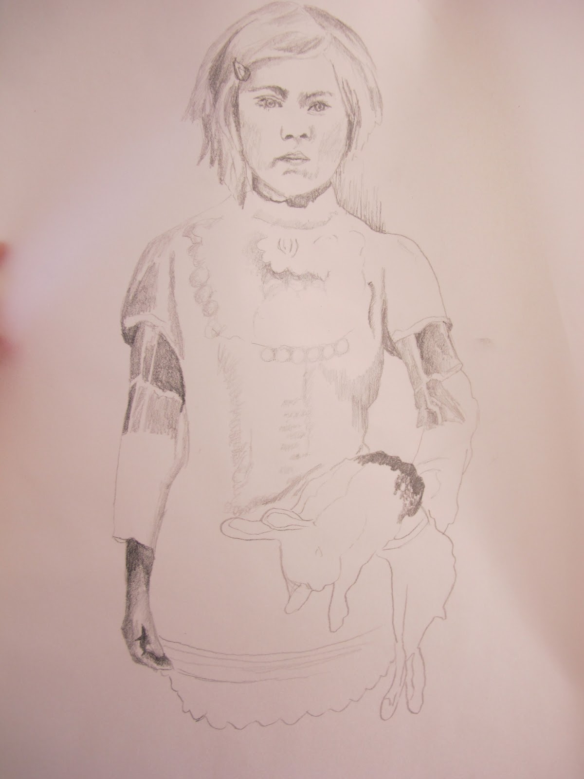
Very early on I started looking at Vee Speers 'The Birthday Party' which is presented 'with a façade of fantasy but with a pared down aesthetic that amplifies the visual intensity through its simplicity'. http://www.veespeers.com/about.php
Although her figures are very static I like the direct gaze, the costuming and the sense of ambiguity in the photographs. I experimented with drawing one of the photographs on tracing paper to make it more ephemeral, the experimented with placing it over a collaged image to superimpose and create layers.

 |
| Emin |
 |
| Emin |
PRINTS
I worked closely with Lucy from my studio to learn the drypoint printing technique. This figure came from my playing fairy painting, although I have cropped the top of the head.
 I had been looking at Paula Rego's work 'Pendle Witches' and felt that the graphic element added a sense of unease. The lack of colour is disturbing to me as I enjoy saturated colour, but at the same time the focus on mark making made me think more specifically about the weight of the figure. The dots on the right side of the face were made using a stabbing action and appear in my opinion, almost pox-like. I intend to print a series of the same image so I can experiment with hand colouring, as well as extracting different characters from my recipe book and other paintings.
 Since learning the drypoint technique, I have experimented with using different printing inks and hand colouring but I prefer the more graphic, payne's grey prints as they are so starkly different to my paintings, introducing a more sinister initial impression.

No comments:
Post a Comment